The interface of search barely changed for twenty years: one box, ten blue links, next page. We got so fluent in it that the design became invisible. Of course search looks like that. But spend enough time with query logs and user sessions, as I did for years working on Google Search, and the uniformity starts to look strange. The queries are not one kind of thing.
Researchers who study information seeking drew this distinction long ago: lookup (a fact, a site, a quick check) versus exploratory search (learning, investigating, deciding). Watching real behavior, I'd add at least two more jobs. Pure navigation, where you know the destination and the search engine is a fast address bar. And opinion-seeking, where what you want is other people's experience and judgment rather than documents. Four jobs, one interface, optimized for none of them.
The one-size interface persisted for an architectural reason, not a lack of imagination. Classic search could produce exactly one kind of response, a ranked list of documents, so every difference in intent had to be flattened into ranking tweaks. Generative AI removed that constraint: a response can now take fundamentally different shapes — a cited paragraph, a structured report, a plain list of links, a chorus of voices. Once the output space opens up, the interface question opens with it. When I started Komo, this became the founding design thesis: don't build a better version of the one interface; build the four journeys.
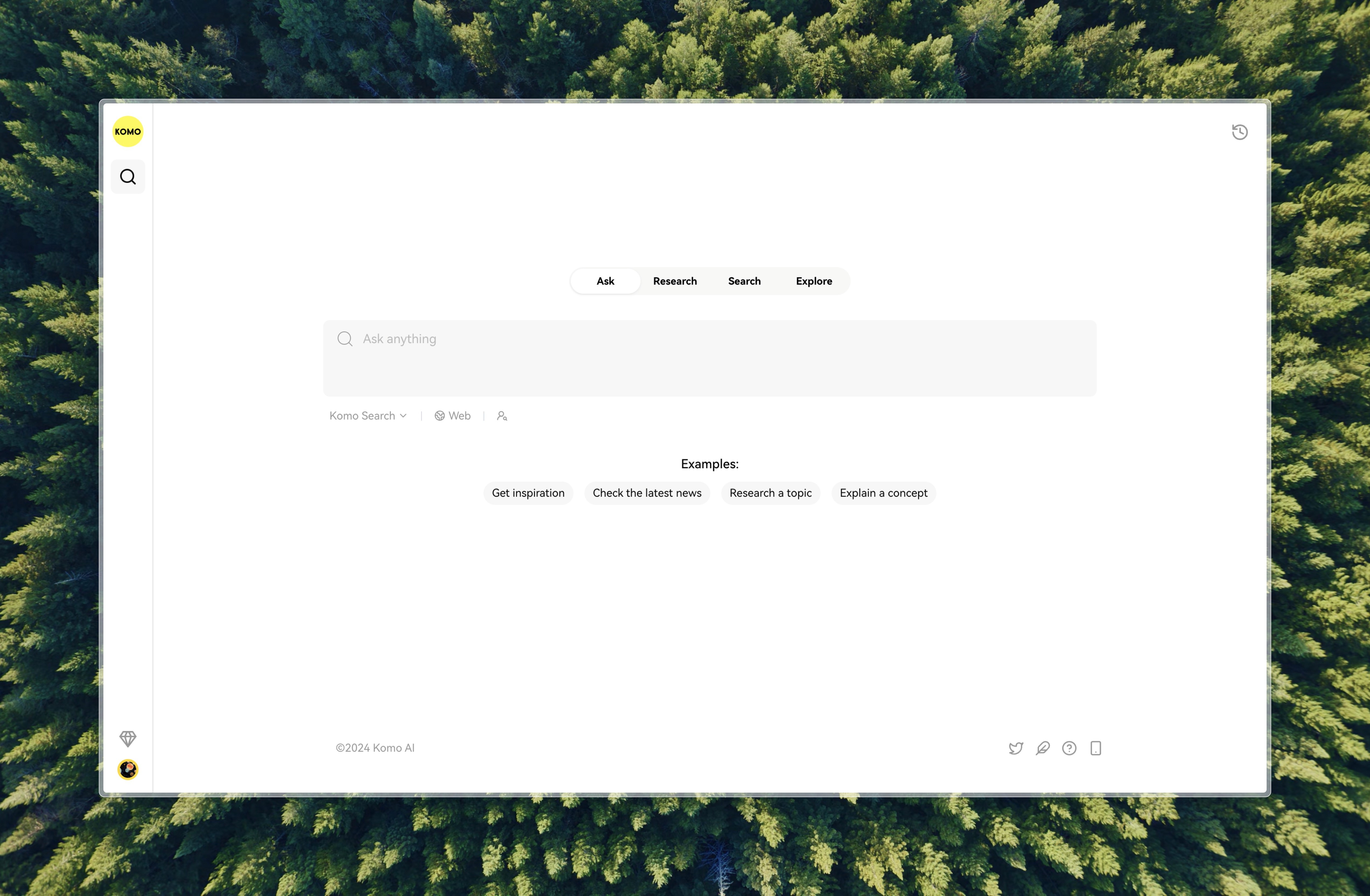
The four journeys
Ask is for direct answers. It retrieves, scans, and prioritizes credible current sources, then returns a structured answer with citations — no sifting. The design constraint is respect for the question's smallness: "What's the population of Tokyo?" deserves a number with receipts, not an essay. (Explaining a concept stretches the same shape without breaking it.)
Research is for questions with questions inside. It decomposes them into steps, investigates each, and compiles a nuanced answer: academic questions, business analysis, anything a single pass would flatten. (This mode grew into its own research program on machine-conducted investigation, which I've written about separately.)
Search is the humble one, and including it was itself a design decision. Sometimes you know exactly which site you want, and an AI answer is an obstacle. Rather than force every query through generation, this mode is tuned navigation: official sites, specific documents, tools, with no answer in the way.
Explore is the one I feel most philosophical about. The more AI-generated text fills the web, the more valuable genuine human perspective becomes. Explore searches opinions across social platforms and blogs for the questions that need lived experience: "What do people say about living in Barcelona?", "Hidden gems in Tokyo according to locals". An AI summary of these would miss the point. The voices are the answer.
Two of the four modes are defined by what the AI declines to do: Search withholds generation entirely, and Explore withholds synthesis. Deciding where the model subtracts value turned out to be as much a part of AI product design as deciding where it adds value. A system confident in its purpose should know when to get out of the way.
The thesis underneath
The specific four-way split matters less than the principle it forced me to articulate: match the interaction to the intent. Every project I built afterward is this principle applied somewhere new — verification interfaces for trust intents, selection gestures for mid-reading curiosity, maps for orientation, agents for delegation. The old excuse for the single general-purpose interface was architectural. That excuse is gone, and keeping the one interface anyway is a cost users pay one mismatched query at a time.
The open question that still interests me is where the modes should live. I made them explicit (visible tabs, a user's choice) because I believed people deserved to see and steer the kind of journey they were on. There's a quieter engineering benefit too: when a person picks the mode, the system doesn't have to guess the intent from a few ambiguous words. The alternative is inferring the journey and routing silently, which is smoother, more opaque, and wrong some fraction of the time in ways the user can't see or correct. That tension between legibility and seamlessness runs through everything I've built since, and I keep landing on the same side: show people the machinery, and let them grab the wheel.